ブログ
Component Driven Development for Static Deliverables: A Retrospective
In the last few years, Design Systems have become a very popular topic in the development and design community. Tools like Styleguidist and Storybook are now pretty commonly used on many projects to maintain and develop a set of common design artifacts that we can generally define as Components. As part of the broader Design System term, this process could be defined Component Driven Development.
Anyway, most of the resources about Component Driven Development revolve around using one of the major frontend view libraries such as React, Angular or Vue. What about more traditional stacks?
At the Standard Design Unit, for example, we are often required to deliver static HTML and CSS assets to be later implemented with server-side solutions like WordPress. In other projects, we directly provide the backend team with a dynamic theme based on some server-side template language like Twig or Phug (Pug template engine for PHP). Either way, it might look like we cannot leverage the benefits of Component Driven Development.
In this article, we’ll describe how we approached this problem and the solutions we have come up with.
Japanese translation: 静的なHTMLのためのコンポーネント駆動開発―その導入を振り返って
Principles of Component Driven Development
The main point of Component Driven Development is to identify small, reusable parts of UI from a design and develop them as discrete units called components. Each component should be developed in isolation to prevent unwanted interferences by the surrounding components and layout parts. This process ensures better reusability and allows for easier testing (see Addy Osmani’s FIRST principles for an in-depth explanation).
Most of our projects are corporate and media websites. Those are very good candidates for CDD, since they usually feature a lot of pages but a relatively small set of repeated UI patterns like lists of cards, buttons, etc. Missing this opportunity just because of a technical problem is a real shame.
Prior approaches
On the CSS side of the frontend, techniques like SMACSS and BEM have pioneered the idea of components long before JavaScript libraries like React. In the beginning it came naturally, then, to rely on CSS as the single source of truth to design and develop our Design Systems in the form of Living Styleguides. Tools like KSS are built around the idea of processing CSS files and build a styleguide that is always up-to-date with the latest changes.
The problem with such tools is in their very nature: as styleguides, they do a great job at communicating and sharing components behaviors across teams, but they lack flexibility and are pretty hard to be used as a development playground. For example, there is usually no live-reload, content customization or JavaScript interactivity.
Migrating to Storybook
For our projects, we decided on Storybook as our CDD environment, mainly because at that time it was the only tool supporting plain HTML story sources.
We identified two viable strategies for migrating a CSS based project to an HTML based component system:
- Treat HTML partials used in the project as large, template oriented components and import them into Storybook.
- Leverage built-in component-like features provided by the template languages we were already using.
We ended up opting for the second strategy and, since our main template language is Pug, we were going to use the mixin feature as our component’s definition method.
To streamline the development experience and reduce the boilerplate, we created a separate package called Storypug that contains all the configurations and helpers needed to ensure a pretty decent developer experience.
Feel free to read the documentation and try the package, we’ll be happy to hear your feedback!
A journey into Pug components
How did our development workflow change after moving to Storybook?
First of all, working with pug mixins started to feel like working with a view library. For example a Button.pug component file would look like this:
Button.pug:
mixin Button(params={})
  - const props = Object.assign({ type: 'button'}, params)
  button.Button(type=props.type)&attributes(attributes)
    span.Button__label
      block
The component could then be imported (ehm included) into a page template and consumed:
about.pug:
include /components/Button/Button.pug

form(method="post")
  //- ...
  +Button({ type: 'submit' }) Send
A second benefit, as you could guess from the previous snippet, is that the CDD approach gives us the ability to structure our project on a per-component basis, which gets reflected in our folder tree. This is one of the possible setups you could use:
- components/
  - Button/
    - Button.pug <-- Pug component
    - Button.js <-- JavaScript behaviors
    - Button.scss <-- Styles
    - Button.stories.js <-- Storybook stories
    - Button.test.js <-- Unit testing
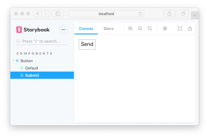
What about Storybook? Continuing with our example, Button.stories.js would look like the following:
Button.stories.js:
import { renderer } from 'storypug'
import Button from './Button.pug'

const { html } = renderer()

export default {
  title: 'Components/Button',
}

// renders just a button
export const Default = () => html(Button, {}, 'Label')

// renders a submit button
export const Submit = () => html(Button, { type: 'submit' }, 'Send')
Here below is the end result.
Testing variations
Building components in isolation with Storybook also gives us the ability to test multiple implementations and variations of the same component.
Let’s imagine a Media component with the following pug and CSS:
Media.pug:
mixin Media(params={})
  - const props = Object.assign({ image: '', reverse: false }, params)
  .Media(type=props.type, class={ '-reverse': props.reverse })&attributes(attributes)
    img.Media__image(src=props.image)
    .Media__body
      block
.Media {
  display: flex;
}

.Media__image {
  flex: 0 0 auto;
}

.Media.-invert {
  flex-direction: row-invert;
}
To verify how the -invert variant renders, we could create two separate stories.
A more compelling solution is using Storybook Addon Knobs to dynamically tweak our component’s props.
The advantage of this approach is that we can test multiple combinations of modifiers in the same story.
In the following example we use the boolean knob to toggle the value of the reverse prop and, at the same time, we use the select knob to switch between two different images with a totally different aspect ratio.
Media.stories.js:
import { withKnobs, boolean, select } from '@storybook/addon-knobs'

import { renderer } from 'storypug'
import Media from './Media.pug'

const { html } = renderer()

const images = [
  'https://via.placeholder.com/150',
  'https://via.placeholder.com/350x150',
]

export default {
  title: 'Components/Media',
  decorators: [withKnobs],
}

export const Default = () =>
  html(
    Media,
    {
      image: select('Image', images, images[0]),
      reverse: boolean('Reverse Style', false),
    },
    '<p>Contents...</p>',
  )
Here below is how the story will look like in the browser:
Implementing JavaScript interactions
Working with JavaScript in an HTML component-driven project poses some questions related to where and how we should apply interactions.
About the where, we suggest to keep JavaScript on feature components. Rephrasing the definition of organism by the Atomic Design methodology: feature components are groups of components joined together to form a relatively complex, distinct section of an interface. That means that compound components like image galleries, forms and modals are good candidates to hold JavaScript logic, while simple buttons and other primitive components should consist just of HTML and CSS.
As for the how, it really depends on the nature and requirements of your project. Most of the time we use Stimulus, a framework built to simplify and organize a frontend codebase in static or server-side powered projects.
We can map Stimulus controllers to feature components and thus develop them in isolation within Storybook.
As an example, let’s build a search component:
Search.pug:
//- load children components
include /components/Button/Button

mixin Search(props={})
  form.Search(
    action="/search"
    role="search"
    data-controller="search"
    data-action="search#send"
  )
    label.Search__field
      span.Search__label Keywords
      input.Search__input(type="search" name="keywords" data-target="search.keywords")
    +Button({ type: 'submit' }) Search
The controller would look like this:
Search.js:
import { Controller } from 'stimulus'

export default class SearchController extends Controller {
  static targets = ['keywords']

  send(e) {
    e.preventDefault()
    const query = this.keywordsTarget.value.trim()

    if (!query) {
      alert(`Type a keyword!`)
      return
    }
    alert(`Fetching results for: "${query}"...`)

    // fetch search results...
  }
}
To initialize the controller, Stimulus requires us to register it into a container Application class instance. In common scenarios the Stimulus application would be bound to the html element, but in our case we need to create an isolated context for our component. To achieve this we’ll use Storypug’s render helper, which renders the Pug component into a DOM tree within a wrapper element. We’ll then use that wrapper element to initialize a local (isolated) application with the search component as its only child controller.
Search.stories.js:
import { renderer } from 'storypug'
import Search from './Search.pug'
import { Application } from 'stimulus'
import SearchController from './Search'

const { render } = renderer()

export default {
  title: 'Components/Search',
}

export const Default = () => {
  // render instead of returning the raw HTML
  const wrapper = render(Search)

  // initialize a local stimulus application
  const application = Application.start(wrapper.el)

  // register (initialize) the Search controller
  application.register('search', SearchController)

  // return the application wrapper element
  return wrapper.el
}
Here below is a demonstration of the component in action:
Improvements in testing process
An added benefit of working with CDD and Storybook is that it makes it easier to introduce unit testing in your codebase.
While, in general, it’s considered best practices to prefer integration over unit testing for frontend projects, our specific scenario can benefit from a feature originally introduced by the Jest framework called snapshots.
By using snapshots, Jest stores the HTML rendered by our component and then, on subsequent executions, matches the component’s HTML with the stored one. That lets us track inconsistencies and possible errors introduced by changes to the component and to its children. More importantly, it also lets us verify that the component is rendering the expected HTML.
With the latest versions of Storybook using stories for snapshot testing is as immediate as importing them into a test file:
Button.test.js:
import { Default, Submit } from './Button.stories'

describe('Button', () => {
  test('matches the Default snapshot', () => {
    expect(Default()).toMatchSnapshot()
  })
  test('matches the submit snapshot', () => {
    expect(Submit()).toMatchSnapshot()
  })
})
The Storypug documentation includes details on how to configure Jest to use .pug templates in test files.
A methodology for the whole team
Until now we have described the advantages of Storybook and CCD for developers. But in reality, this approach opens the way to a new set of development workflows that the whole team can benefit from.
For your internal team
In fact, even when adopting an agile approach to development, it is sometimes difficult to share your progress within a multi-disciplinary team.
Providing designers and project managers with a navigable, curated preview of your work allows for early feedback and validation.
On small projects, you could create a static build of Storybook and publish it to a private web space to be shared with team members.
On large scale projects, possibly involving multiple developers, you could setup a continuous deployment system that publishes an updated version of the style guide for every branch at each push (a good candidate for this task is Netlify).
Another part of the team that benefits from the CDD approach as described until now, are backend developers. When the frontend and backend template implementation happens at different stages, a backend developer can use Storybook both as a dictionary to browse components and as a benchmark to validate the final, production-ready implementation.
For stakeholders
Another aspect of using CDD and Storybook we have found valuable is that it helps us improve the communication with clients and stakeholders.
Developing a page template, especially in the earlier phases of a project, can be a lengthy process that could leave the stakeholders without any tangible proof of your efforts and progress.
Instead, presenting a style guide like Storybook to stakeholders can convey to them that your team is committed to the project. It is also a good deliverable to outline the kind of effort (in terms of components) needed to create supposedly simple UI patterns like, for example, off-canvas menus.
As a documentation tool
Moreover, with the latest addition of the Docs addon in version 5.2, Storybook can be used as a full-fledged documentation tool.
Besides JavaScript stories, Storybook now supports Markdown and MDX files, allowing both developers and non-developers to write rich documentation for components, design guidelines and integration guides.
With MDX, an extension of Markdown supporting React components, you can also use a set of built-in components to present the project’s typography and color palette in a graphic and intuitive way (see this article for more details).
Conclusion
While migrating our processes and tools to Storybook has sometimes proven challenging, in the end we found great value in the potentials it unlocked for a Component Driven Development approach to static deliverables.
In this article we focused mainly on pug, but the same approach could apply to a vast array of template engines widely used in static site generators such as Nunjucks and Twig.